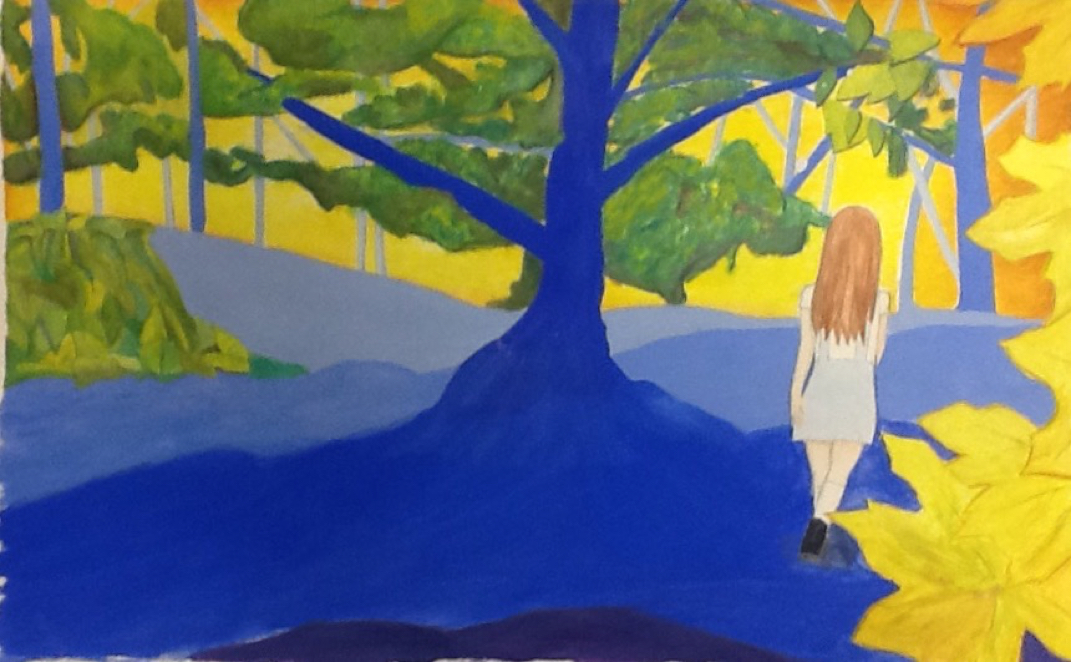
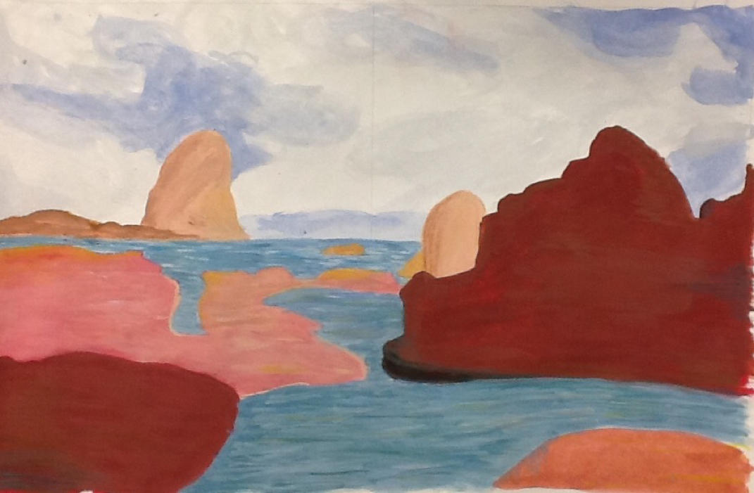
 This is my bright landscape painting. I used water colors to makes this. I used water colors to depict the landscape of cannon beach. I took this photo last summer when I went there on vacation. I learned how to make my paintings pop by using complimentary colors that contrast each other. This uses color and contrast and value. This painting reminds me of a happy summer day. The bright colors convey a cheery mood and good vibes. This is my portrait painting. I used water colors to makes this. I took three different photos of myself to start off my drawing. One three quarter view of each side of my face and one straight on. I learned how to better shape and form to create amore human an realistic looking face. The primary elements used are form, value and shape. In these paintings I look content and looking into the distance in the two three quarter view painting. Although I the center one I have a slight smile and a twinkle in my eye indicating that I know something that you do not. 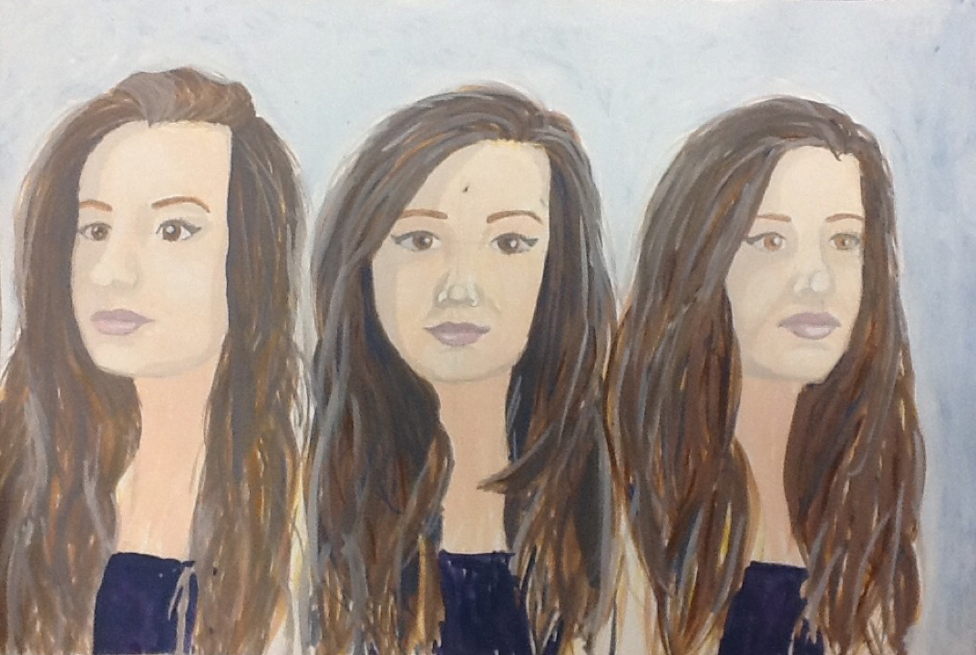 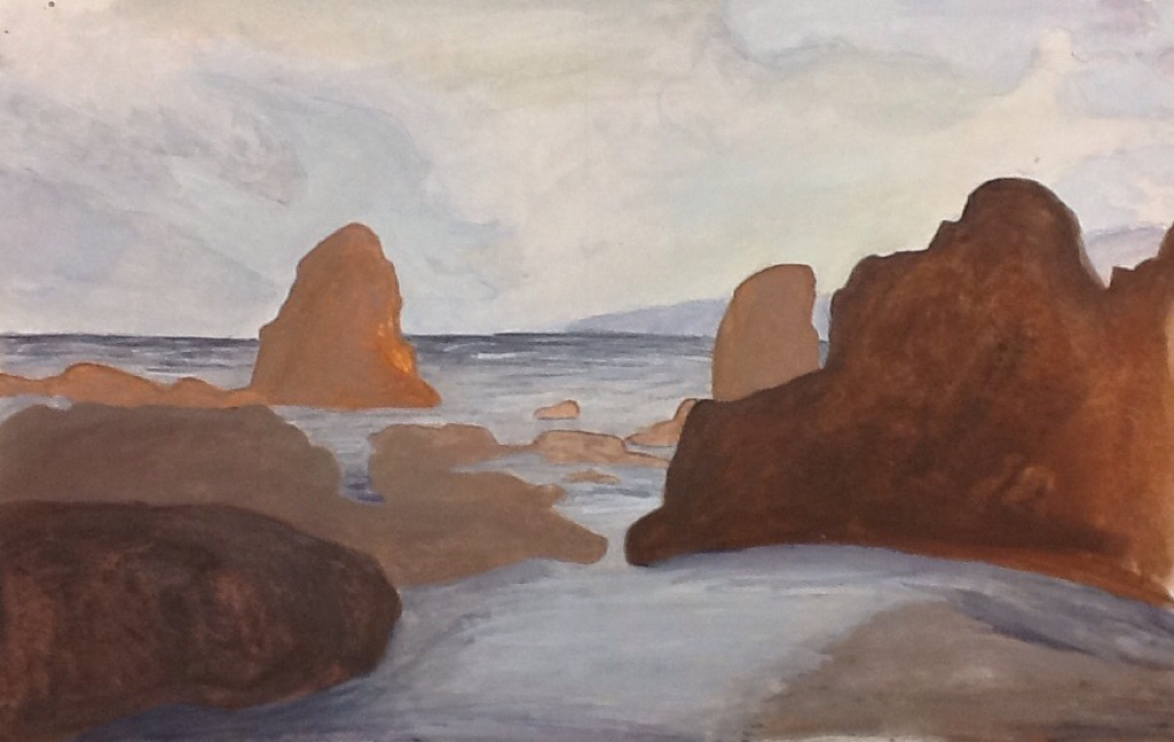 This is my dull landscape painting. I used water colors to makes this. I used water colors to depict the landscape of cannon beach. I took this photo last summer when I there on vacation. I learned how to better use space to convey a realistic yet interesting painting. The primary elements used are space, value and shape. This painting is dark and haunting due to the dark colors used. It looks like a stormy day and a day that a person would have very bad luck and would not want to be out on the water. 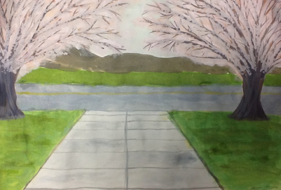 This is my landscape puzzle piece painting. I used water colors to makes this. My table took three different photos of the outside that all lined up. We each painted our own and then lines them up out in the hallway. I learned how to better use space and color to create a realistic landscape. The primary elements used are space and color. The colors all work together to create a sense of unity and harmony on a nice cool spring day. The blossoms on the tree give the picture a nice happy vibe against the cool blue sky. This is the moving lines drawing. We used pencil to create moving and overlapping lines using value. I learned that if you erase the edge of the line right before another one overlaps it, it looks even more real creating even more of a sense of movement. The main art elements were lines, value and space. This piece conveys the feeling of confusion and illusion. There are a myriad of different ,Inez that varyin size, shape and value that add to this. It has a point of focus though where everything connects in the drawing giving it order among all the confusion. 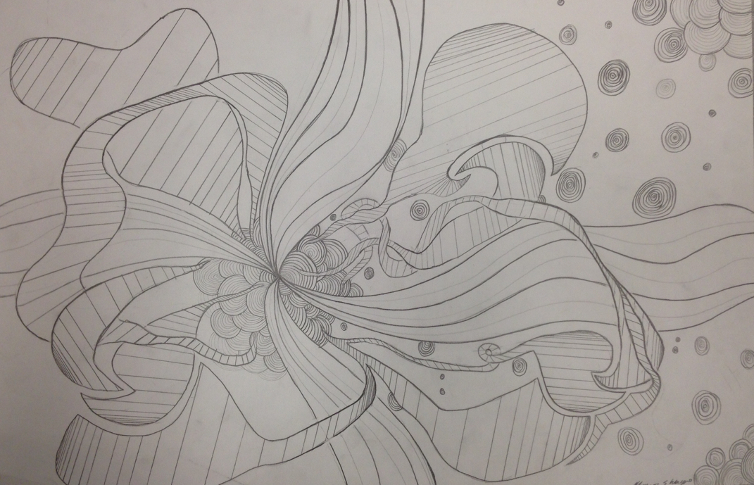
|
AuthorWrite something about yourself. No need to be fancy, just an overview. ArchivesCategories |
 RSS Feed
