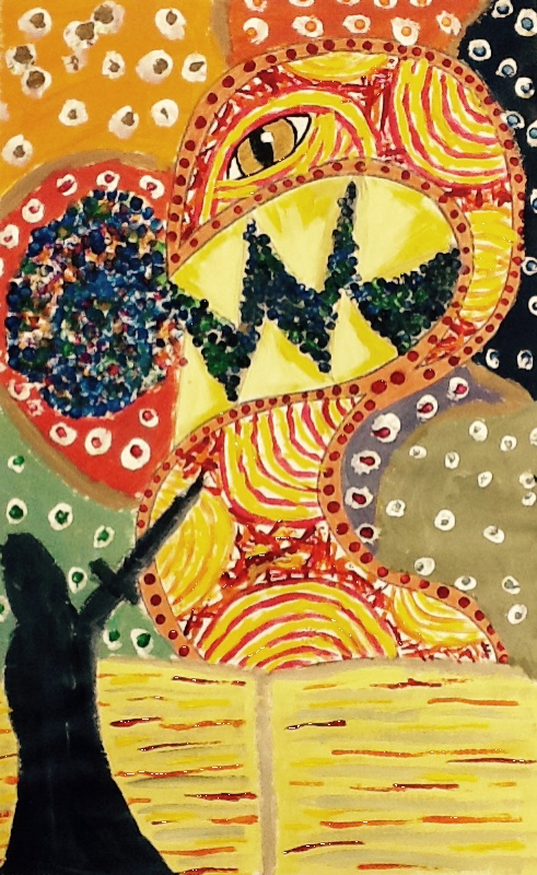
This is my Dream Time Painting. This is an abstract painting that I did and I stuck mostly to arm colors. I added an eye in the middle with a pupil that is slitted like a cats pupil. I chose to do that do give the figure a less human and more vicious feel. I then drew this black looming presence at the bottom of the page that looks as if it's slaying the terrifying creature. I loved doing this project because it's the first time that I have ever painted anything abstract. I learned how to make sure that there was no white space a and how to convey emotions through lines, dots, and colors. The main art and design elements in this project are color, contrast and rhythm. This dreamtime conveys a kind of almost scary yet triumphant feeling. Between the horrifying creature in the center with an eye and triangles that look like teeth and the looming creature slaying it, it is really cool. Also is looks as if the two of them are coming out of a book at the bottom of the page, thus describing the experience of reading a book.
This is my pen and ink drawing. I used a pen and India ink in order to draw a lotus flower. I learned a lot of stuff during the project, but the most dominate skill that I learned was being able to draw edges by using value. The main art element was obviously value. This project is important because it is preparing me for my block print in which I will have to carve this image into a block. This drawing has extremely high contrast and it's extremely dramatic. The flower is open but it almost looks menacing like it's welcoming you to your death. This is my self portrait painting. As the title so clearly states, it's a self portrait of myself that I created using paints. In doing this project I learned how to make it appear that light is shining on the subject from one specific direction using contrast and balance which are two of the principles of design. Also, I used the art element of value in order to indicate the degree of light and dark in the painting. In this self portrait I look as if I am staring off into the distance at something that makes me sad. The glisten in my eyes and the set of my mouth are what indicate it. When I stare into the face of my self portrait it evokes memories of the past. The contrast of highlights in my hair and the layering of the paint for my skin make the painting to appear lifelike. This is my self portrait painting. As the title so clearly states, it's a self portrait of myself that I created using paints. In doing this project I learned how to make it appear that light is shining on the subject from one specific direction using contrast and balance which are two of the principles of design. Also, I used the art element of value in order to indicate the degree of light and dark in the painting. In this self portrait I look as if I am staring off into the distance at something that makes me sad. The glisten in my eyes and the set of my mouth are what indicate it. When I stare into the face of my self portrait it evokes memories of the past. The contrast of highlights in my hair and the layering of the paint for my skin make the painting to appear lifelike. This is the watercolor leaf painting. Using paint were able to portray a still life image of leaves. In this assignment I learned to use layers in paintings to give it amore realistic look. The main art elements I this piece are color, form, shape, space and value. This drawing reminds me do a cold crisp fall day. It makes makes me want to curl up in a blanket, drink hot cocoa and watch a movie while the rain falls outside. This drawing is a sort of happy kind of comfort because it reminds me of my favorite time of year. This is my one point perspective hallway drawing. This is my part of a group hallway drawing that portrays one of the many hallways of Mount Si High School. Using pencil I was able to master one point perspective to give the drawing a realist look. The main art elements were proportion, size, value, and lines. This is a very basic but realistic drawing of a school and it makes me feel happy to see how good it turned out. This is my one point perspective illusion. This is my first non-pencil piece of art. For this I cut and glued small pieces of construction paper onto a whole piece do construction paper of a different size. I learned that when the point of perspective is off enter the piece of art looks more interesting. It looks more interesting because it sort of looks like an illusion. I loved this little project because it was fun to cut and paste with fun colors. When I looks at this the bright colors really make me happy. This is my parallel lines drawing. I created this piece of art by only drawing various parallelograms. Because of the different values and sizes this looks 3D even though I only drew it with pencil. This being my second drawing I learned from all of my mistake of my first drawing to make a truly spectacular piece of art. I did things like make sure my ruler was clean, use sharper pencils, and pay attention to different values and overlapping. One point perspective illusion. The main art elements are lines and values. I feel really good about this drawing. I can very clearly see the improvement I've made since my first drawing. It looks really neat, thought out, and not sloppy. |
Meagan WayneI am a sophomore at Mount Si High School and I am in beginners art. Archives
January 2015
Categories |